Understanding Delta-E
Delta-E (ΔE) is a measurement used to
indicate how much a color deviates from an accepted
standard. The higher the ΔE, the more inaccurate the color.
Perfect color has a ΔE of zero. However, we need not achieve
a ΔE of zero. This is because the human eye is only capable
of detecting color difference at certain thresholds. The
minimal detectable difference is about 1 ΔE. Calibration
generally seeks to achieve a ΔE for white and all of the
primary and secondary colors of no more than 2.5. However,
unless a display has a fully-realized color management
system (the vast majority do not), it is unlikely that
calibration can achieve this level of performance for the
primary and secondary colors. On the other hand, since
virtually all displays have a full compliment of gray scale
adjustments, calibration can usually meet this standard for
white.
History
ΔE came into widespread use after the
CIE (Commission Internationale De L'Eclairage or
International Commission on Illumination) announced in 1976
two new color appearance models that were to replace the
standard XYZ model for measuring color that had been in
place since 1931. Why the need for a new standard? The
reason has to do with the fact that researchers had known
for some time that the existing standard was not
perceptually uniform. Perceptual uniformity is the ability
of a color appearance model to plot changes in color that
accurately represent what we actually see. The standard CIE
diagram shown on the
Understanding Color Calibration page is NOT perceptually
uniform. To see how, consider the diagram below, which is
another representation of the 1931 CIE diagram.
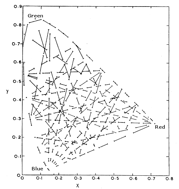 |
| 1931 CIEXYZ Chromaticity Diagram shown
with perceptual non-uniformity indicators
|
Notice that the lines inside the diagram
are not of equal length. This indicates that at different
points on the graph, the distance between two colors plotted
on the graph is much larger than the difference people see
between those colors. What the CIE wanted was a color
appearance model that reduced this problem as much as
possible. So, in 1976 the CIE recommended two new color
appearance models that were significantly more perceptually
uniform than the 1931 CIEXYZ standard represented by the
chart you see above. These 2 standards were CIELUV and
CIELAB, and they both improved perceptual uniformity from
the 20:1 that the old system provided to about 4:1. Not
perfect to be sure, but much better.
Why, you might ask did the CIE recommend
TWO color appearance models to replace the single 1931
standard? Although both CIELUV and CIELAB were roughly
equivalent in accuracy, CIELAB was clearly the favored
model. However, it lacked something that many industries
thought was essential: a chromaticity diagram that could
plot the primary and secondary colors on straight lines.
CIELAB offered none, but CIELUV did. Thus, the CIE offered
both standards as something of a compromise. These two color
appearance models also included a formula for calculating
color differences. This has become known as ΔE76, which
could be calculated from CIELUV or CIELAB data.
Unfortunately, color researchers began
to notice that ΔE76 had it own problems with perceptual
uniformity, so work continued on an even better color
difference formula. In 1994 CIE approved a new formula,
based exclusively on the CIELAB model. This is known as
ΔE94.
CIE has continued to further refine
methods for measuring color differences, including the
adoption in 2000 of a new CIELAB standard (ΔE2000), which,
for a variety of reasons, was never widely used. ΔE94
continues to be arguably the best and most popular of the
color difference formulas. However, because CIELUV and its
associated ΔE76 formula is still the only approach that
offers a linear chromaticity diagram, it is still widely
used in the video industry.
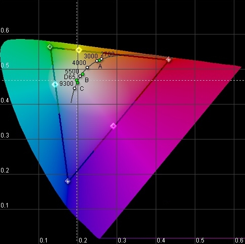 |
| 1976 CIELUV Chromaticity diagram
|
I continue to use the old-fashioned 1931
diagram, only because people are more familiar with it and I
don't mind the fact that it tends to exaggerate certain
color errors, especially in green. On the other hand, I use
ΔE94 as a measurement of color difference. Because of this,
you may notice that the ΔE numbers I report seem smaller
than those you may have seen elsewhere. This is because many
people in the video industry continue to use ΔE76 and ΔE94
numbers are almost always on a smaller scale. For example, a
very large chromaticity error in green that has a ΔE76 of 50
is equivalent to a ΔE94 error of around 12. The error is the
same. It is just that the method for reporting is scaled
lower.
|